关于css的一些学习记录

1.单行文本溢出(部分浏览器需要加上高度)

1
2
3
overflow: hidden;
text-overflow: ellipsis;
white-space: nowrap;

2.多行文本溢出

1
2
3
4
5
overflow : hidden;
text-overflow: ellipsis;
display: -webkit-box;
-webkit-line-clamp: 2;
-webkit-box-orient: vertical;

上面方法合适WebKit浏览器或移动端(绝大部分是WebKit内核的)浏览器。

其他浏览器解决方案:

目前没有什么CSS的属性可以直接控制多行文本的省略显示,比较靠谱的办法应该就是利用相对定位在最后面加上一个省略号了,代码可以参考下面

1
2
3
4
5
6
7
8
9
10
11
12
13
14
15
p {
position:relative;
line-height:1.5em;
/* 高度为需要显示的行数*行高,比如这里我们显示两行,则为3 */
height:3em;
overflow:hidden;
}
p:after {
content:"...";
position:absolute;
bottom:0;
right:0;
padding: 0 5px;
background-color: #fff;
}

不过这样会有一点问题:

1)需要知道显示的行数并设置行高才行;

2)IE6/7不支持aftercontent,需要添加一个标签来代替;

3)省略号的背景颜色跟文本背景颜色一样,并且可能会遮住部分文字,建议可以使用渐变的png背景图片代替。

3. 纯css实现容器高度随着宽度等比例变化

1)利用一个隐藏图片来实现

假如你想要容器的宽高比是4:3,那就选一个宽高比正好是4:3的图片,把这个图片放到容器里。设置图片宽度100%,高度auto,那么图片会把这个容器撑开,正好撑开到4:3。然后可以隐藏这个图片。

1
2
3
4
5
6
7
8
9
10
11
12
13
14
15
16
 #container {
width: 100%;
}
.attr {
background-color: #008b57;
}
.attr img{
width: 100%;
height: auto;
}
</style>
<div id='container'>
<div class='attr'>
<img src="1.png" alt="">
</div>
</div>

如果你觉得增加img标签多发了http请求,那么你可以把图片变成base64格式,由于我们的图片没有实际显示作用,我们可以大胆压缩。所以既没有http请求,还可以让图片很小。

2)可以利用css3的calc函数.(利用第二种情况来实现)

第一种情况 position:absolute

如果元素是position:absolute的话,那么百分比基准是相对他父级元素中第一个position:relative元素的宽和高为基准的。

比如position:relative元素的width为200px,height为100px

那么position:absolute元素里

1
2
width:calc(10%)  // 20px
height: calc(10%) // 10px

第二种情况 普通文档流中元素

这种情况元素的宽和高的百分比基准都是父元素的宽度。

比如一个div的父元素宽度是200px,高度是100px.

这个div设置

1
2
width:calc(10%)  // 20px
height: calc(10%) // 20px

后来自己证实得知,calc函数不区分文档流和absolute元素

加入父元素宽为200px,高为100px

1
2
3
4
width:calc(10%)  // 20px
height: calc(10%) // 10px
margin: calc(10%) // 20px
padding: calc(10%) // 20px

对于宽和margin和padding值,百分比是基于父元素的宽度

对于高,百分比是基于父元素的高度

3)使用padding-bottom实现

padding-bottom属性值百分比是按照父容器宽度来计算的,所以所以这里我们设置容器宽度为父容器的50%;padding-bottom也为50%;就都是父容器宽度的50%;显示出来就是一个完美的正方形了

1
2
3
4
5
6
7
8
9
10
11
12
13
14
15
16
17
<style type="text/css">
#container {
width: 80%;
height: 500px;
}

.attr {
width: 50%;
height: 0;
padding-bottom: 50%;
background-color: #008b57;
}
</style>

<div id='container'>
<div class='attr'></div>
</div>

4) 利用canvas来固定容器宽高比(4:3)

1
2
3
4
5
6
7
8
9
10
11
12
<div class="container">
<canvas width="4" height="3"></canvas>
</div>
<style>
.container {
width: 100%;
}
canvas{
width:100%;
}
</style>
// 利用canvas将容器撑开,并且容器宽高比就是canvas的宽高比

4. 行高

1)line-height的含义

1
2
3
4
line-height:26px; 表示行高为26个像素
line-heigt:120%;表示行高为元素本身字体大小font-size的120%(如果自身没有设置font-size,那就是父容器的font-size,因为font-size也和line-height一样也有继承)
line-height:2.6em; 表示行高为元素字体大小font-size的2.6倍
line-height:2.6;表示行高为当前字体大小的2.6倍

2)line-height的继承性

(a)带单位的行高继承的是计算值(em,%都算是单位)。

​ 如父元素的字体大小为14px,定义行高line-height:2em;则计算值为 28px,不会因其子元素改变字 体尺寸而改变行高。(例如:父元素14px,子元素12px,那么行高就是28px,子元素虽然字体是12px,行高还是父元素的行高)

(b)不带单位的行高是直接继承(数字),比如父容器line-height:2,那么子元素line-hieght也是2。

​ 如父元素字体尺寸为14px,行高line-height:2;子元素字体为12px,不需要再定义行高,他默认的行高为24px。(例如:子元素12px,他的行高是24px,不会继承父元素的28px)

例子:

1
2
3
4
5
6
7
8
9
10
11
12
13
14
15
16
17
<style>
.haorooms_bfb{font-size:14px;line-height: 150%; background: green;padding:10px}
.haorooms_nodw{font-size:14px;line-height: 1.5; background: green;padding:10px}
.haorooms_children{font-size:26px;background: red}
</style>

<div class="haorooms_bfb">
<div class="haorooms_children">行高测试</div>
</div>

<br/><br/>

<div class="haorooms_nodw">
<div class="haorooms_children">行高测试</div>
</div>
// 有百分比的haorooms_children 继承了父级元素14*1.5=21px
// 没有百分比,不带单位的是自己的1.5倍,也就是26*1.5=39px;

5.图片在容器里水平垂直居中

1
2
3
4
5
6
position: absolute;
top: 0;
left: 0;
right: 0;
bottom: 0;
margin: auto; // 这个是关键点

适用场景:图片比容器小。

如果图片比容器大,则只会进行上下居中,左右不会居中。并且图片不会进行缩放,如果想要缩放,请自行设置height: 100% 或者width: 100%
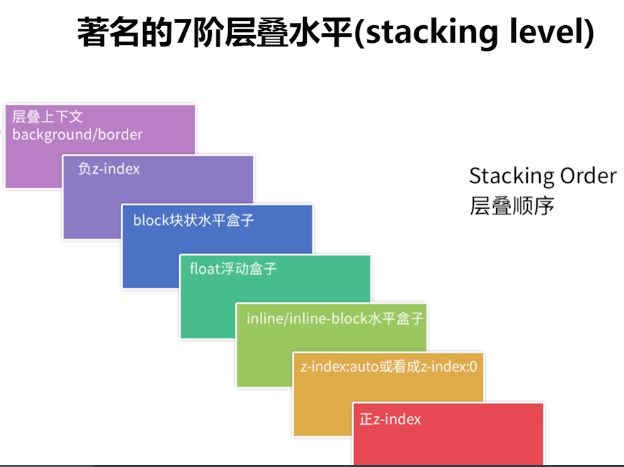
6. 层叠顺序

7. 滚动加载更多

在容器元素上加’list-wrapper-for-load’类,在内容元素上加’list-content-for-load’

注意:容器元素必须固定高度,并且 设置overflow: auto或者overflow:scroll, 否则无法触发滚动事件

1
2
3
4
5
6
7
8
9
10
11
12
13
14
15
16
17
18
19
20
21
22
23
24
25
26
27
28
29
import Vue from 'vue';
const Feed = Vue.extend({
mounted() {
$(this.$el.parentNode)
.find('.list-wrapper-for-load')
.map((index, item) => {
$(item).on('scroll', this.scrollAndLoadMore);
});
},
beforeDestroy() {
$(this.$el.parentNode)
.find('.list-wrapper-for-load')
.map((index, item) => {
$(item).off('scroll', this.scrollAndLoadMore);
});
},
methods: {
scrollAndLoadMore(event) {
const $target = $(event.target);
const contentHeight = $target.find('.list-content-for-load').height();
const scrollTop = $target.scrollTop();
if (contentHeight - 200 < $(window).height() + scrollTop) {
this.loadMore();
}
}
}
});

export default Feed;

8.光标下划线跟随效果

1
2
3
4
5
6
7
<ul>
<li> 不可思议的CSS</li>
<li> 导航栏</li>
<li> 光标下划线跟随</li>
<li> PURE CSS</li>
<li> Coco</li>
</ul>
1
2
3
4
5
6
7
8
9
10
11
12
13
14
15
16
17
18
19
20
21
22
23
24
25
26
27
28
29
30
31
32
33
34
35
36
37
38
39
40
41
42
43
44
45
46
47
ul {
display: flex;
position: absolute;
width: 800px;
top: 50%;
left: 50%;
transform: translate(-50%, -50%);
}

li {
position: relative;
padding: 20px;
font-size: 24px;
color: #000;
line-height: 1;
transition: 0.2s all linear;
cursor: pointer;
}

li::before {
content: "";
position: absolute;
top: 0;
left: 100%;
width: 0;
height: 100%;
border-bottom: 2px solid #000;
transition: 0.2s all linear;
}

li:hover::before {
width: 100%;
top: 0;
left: 0;
transition-delay: 0.1s;
border-bottom-color: #000;
z-index: -1;
}
// 重点 在于 css选择器的运用
li:hover ~ li::before {
left: 0;
}

li:active {
background: #000;
color: #fff;
}

9. 页面内容不足一屏幕,footer处于窗口底部 ;页面内容超过一屏幕,footer处于页面底部。

1
2
3
4
5
6
7
8
9
10
11
12
13
14
15
16
17
18
19
20
21
22
23
24
25
26
27
28
29
30
31
32
33
34
<html>
<head>
<style type="text/css">
html,
body {
height: 100%;
padding:0;
margin: 0;
}
.content {
padding-bottom: 30px;
min-height: 100%;
box-sizing: border-box;
text-align: center;
}

.wrap:after {
content: '暂无更多内容';
font-size: 12px;
color: #cacaca;
display: block;
text-align: center;
margin-top: -17px;
}
</style>
</head>
<body>
<div class="wrap">
<div class="content">
内容高度不确定
</div>
</div>
</body>
</html>

关键点在于:虽然content里面的元素高度不确定,但是设置content的min-height为100%;在content的父元素上加一个after伪元素(其实就是加一个和content同级的兄弟元素。如果底部元素很多,不太方便用after那就直接在content后面加一个div,也是一样的 原理;如果底部元素简单,直接只用after可以让元素层级更简单);同时让content有一个padding-bottom来给底部元素让位,底部元素设置一个margin-top为负数,这样底部元素自身就网上移动了。

10. border-radius 与overflow 问题

第一部分:问题由来:
1
2
3
<div class="wrapper">
<div class="content"></div>
</div>
1
2
3
4
5
6
.wrapper {
width: 100px;
height: 100px;
border-radius: 6px;
overflow: hidden;
}

当外层div需要一个圆角时,需要设置overflow:hidden来遮盖里面content类的超出圆角部分的内容。

如果content类的内容很少,不需要滚动的时候上面的写法没有问题。但是当content类的内容很多,需要滚动展示的时候,设置overflow: hidden; 就会不能滚动,所以需要写成overflow: auto;

然而你会发现写成overflow: auto; 之后border-radius: 6px;就不生效了,圆角看不见了。这时候需要用到mask-image 属性。遮罩图片是一张1px的全黑图片。

最终css长这样:

1
2
3
4
5
6
7
8
.wrapper {
width: 100px;
height: 100px;
border-radius: 6px;
overflow: auto;
// 修复border-radius不生效问题
-webkit-mask-image: url('data:image/png;base64,iVBORw0KGgoAAAANSUhEUgAAAAEAAAABAQMAAAAl21bKAAAAA1BMVEUAAACnej3aAAAACklEQVQI12NgAAAAAgAB4iG8MwAAAABJRU5ErkJggg==');
}
第二部分:mask-image解析

mask-image即遮罩,就是在原始内容基础上只显示遮罩图片透明的部分(透明:没有,黑色:透明,白色:不透明,其它:介于两者之间)

具体可以看文章1文章2